Note from 29 July 2021
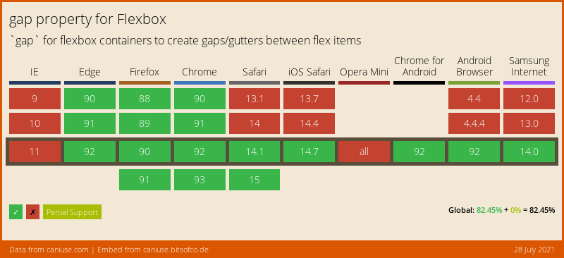
Based on #CanIUse data, using gap with Flexbox with no fallback means half iOS users won't get the right layout.
It might be a bit too soon… 🥲
Based on #CanIUse data, using gap with Flexbox with no fallback means half iOS users won't get the right layout.
It might be a bit too soon… 🥲
While we wait for browsers to implement the text-wrap: balance; #CSS property and value for text (pleeeeeease! 🙏), I may have created a silly — and probably sub-optimal — function to do it with HTML block elements:
https://codepen.io/nhoizey/pen/mdjbrVx
Tell me what you think!
But why? Just because a colleague needed it, we could not find a solution in pure CSS, and I like challenges… 😅

The web is good at these things, just not in the ways that designers have been accustomed to working. We'll take a look at how we got here and how…
When I import my Google Analytics data in #CanIUse, it says only 80 % of my visitors have support for CSS clamp(), while it's 90 % globally. 🤔

I have almost only tech-savvy visitors, so I don't understand. 🤷♂️

Nils Binder
A new nice responsive layout trick built upon Heydon Pickering's Flexbox Holy Albatross.
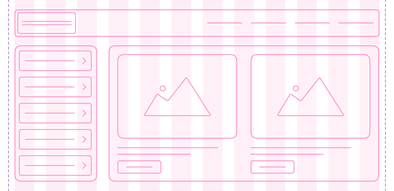
I'm a developer, not a graphic designer, so I genuinely wonder if CSS Grid and Flexbox automated layout and space management would be better for the flexible Web than such rigid artificial grids. I'm really wondering.
Responsive Grid Design: Ultimate Guide
This article highlights the most important aspect of the responsive grid and how product designers can adapt grids in their design workflow. medium.muz.li/responsive-grid-design-ultimate-guide-7aa41ca7892
 Donnie D'Amato